Coast & Creek - creating a photo book


Earlier this year I was given the opportunity to try out the professional range of photo books at Saal Digital. Saal Digital are an online printers offering a range of products such as prints, cards, calendars and obviously photo books. The professional range is at the top end of things and I was given a £100 voucher with which to create my own photo book… read on to see how it went.
The design
The process was pretty straightforward, choose from a number of size options, cover materials, papers and page extents and then design your book. I decided to see what you could get for £100 which isn’t a small sum to be spending on a single book. I had originally planned a 30cm square book but that option didn’t give me many pages for my money so I opted for a 52 page, A4 landscape book with photo matt paper and a natural linen cover. Designing the book was very easy using the Saal software which is simple to use and has a huge range of layout options, each of which is editable. It is fairly intuitive in use but not with our its quirks. I found it impossible to import images from any folders on my desktop for example, easily solved by moving the images elsewhere but the page layouts were a bit more frustrating. The options for different page layouts seem to appear at random. On several pages spreads containing two images there would be completely different layout options, which made uniformity a lot more time consuming that it needed to be. It could also be rather hit and miss whether images would go in the boxes you wanted them to but I guess, as with any software, these things become second nature with more use. If they don’t or non of the templates are suitable there’s always the option to create your own artwork using something like Adobe Indesign or even Photoshop and sending PDFs.
By far the hardest part of the design was choosing first a theme for the book and then the images themselves. I opted, after many false starts, to go with the simple theme of the East Anglian coast. It is an area I have photographed for many years and so have a deep pool of images to work with. Even choosing photographs for such a simple and broad theme though is incredibly time consuming (and the size of the image library turned out to be more of a hindrance than a help) and curating them into an order that flowed through the pages even more so. It was an enjoyable process though and as I worked the idea evolved a little and I decided to group the images by their subject, colour and tone rather than their geographical proximity.
One of the problems with ordering printed products online can be knowing how to prepare the artwork so that the tones and colours on the finished print bears some resemblance to the images that you have painstakingly edited to a state of perfection (or spent 10 minutes sliding a few sliders). Clearly a print is never going to look the same as a bright backlit screen but there are tips you can take to make sure the print isn’t a disappointment. This isn’t the time to go into those detail but the Saal website has a lot of information on how to prepare your images including resources such as downloadable profiles to use for soft proofing (simulating on screen the look of the print) in Adobe Lightroom or Photoshop.


The result
Having spent a bit of time laying the book out and soft proofing the images, I sent my design off and was actually rather excited when a few days later a parcel from Saal plopped through the letter box.
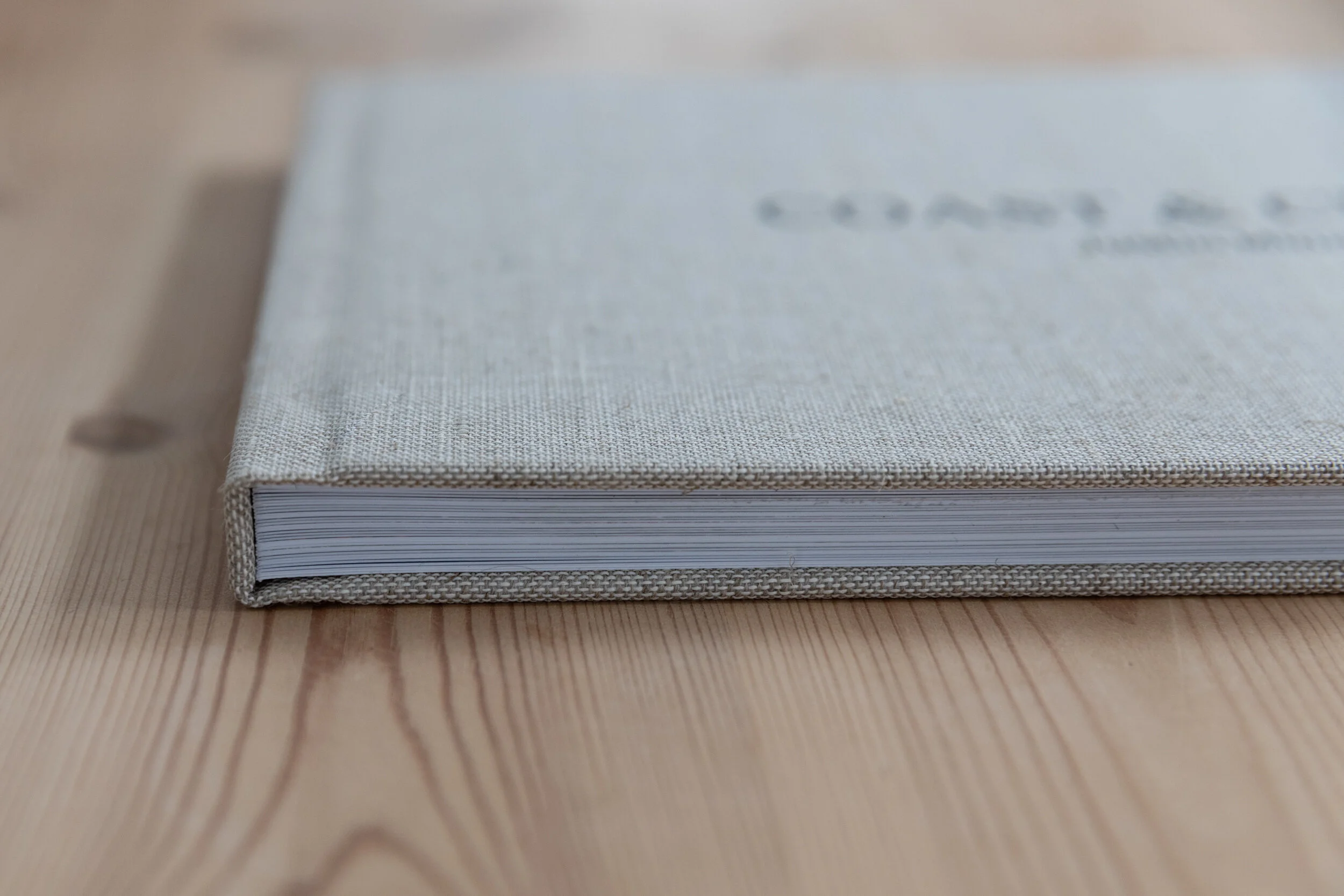
First of all, the cover was a thing of beauty. I really wasn’t sure how any of the offered cover finishes would look in reality so I was very pleased to find the natural linen was a heavy textured linen with an expensive feel. Foil blocking would look amazing on this but the printed cover text was impressively sharp on such a course medium.
The inner pages weren’t so impressive however. The print quality was very good but I was rather disappointed with the paper. I like a matt finish paper and so from the list of photo gloss, photo matt or high end matt, I chose photo matt. I think in hindsight if I had given it more thought I would have realised that what I really wanted was high end matt but I couldn’t find information about which papers were used in the professional range of photo books. As it turns out, photo matt is actually a standard ‘lustre’ photo paper so the book has the feel of being rather hand made from photo prints which rather lets it down.
The finishing feels a little hand made as well. The pages are flawlessly cropped and bound as you can see from the photo below left but where the pages are stuck in to the cover at the front and back it isn’t straight. The book doesn’t quite sit flat either, the outer edge of the cover seems to splay outwards so, as you can see in the photo below right, there is a gap in the pages near the back of the book.

The verdict
The service from Saal was very good and the offer to create my own book was very generous and greatly appreciated but I have to say I would have been a little disappointed to have paid £100 for the book. Aside from the paper (which I would, had time allowed, ordered samples before ordering my book) my niggles are small but not expected on a pro product at this price point. I don’t want to end on a negative though, to be fair had I paid for the book, I would have gone back to them about the issues and judging by the quality of the service, I have no doubt they would have been put right. Chances are I was just unlucky as I have seen several similar reviews from photographers, all of which have been positive.
